ZONA UFEC
Client: TV3 - UFEC
Agency: UFEC
Category: TV - Visual Identity Rebrand - Art Direction - Motion Graphics - 3D
CASE STUDY
ZONA UFEC is a TV3 Show broadcasted since 2011 on the Esport 3 channel. The program takes the pulse of the situation of Catalan sport in all the different disciplines. Through reports and interviews and in collaboration with the Unió de Federacions Esportives de Catalunya (UFEC), every week he reviews the successes and work of Catalan athletes in competitions in Catalonia and around the world.
The client’s target was to completely renew the image and identity of the program, adapting it to today’s narrative and audiovisual standards, thereby creating an impact that would keep the viewer’s attention at all times.
For this, it was necessary to redesign each one of the elements of the program, from the mask or intro, going through the labels, the report and section separators, the promotional animations of the UFEC until the closing of the program.
Since ZONA UFEC is published in two different places (TV3’s Esport 3 channel and YouTube channel UFECtv) I created two versions of customizable templates from scratch to create the show’s opening. A longer & non-variable version based on the principles promoted by the UFEC and another version by way of summary that allows weekly changes to both the background videos and the headlines of the disciplines to be discussed, without affecting the aesthetics of the audiovisual of the program.
MOODBOARD
A Mood Board is a set of images, materials, colors, etc., which aims to understand and project a style and graphic concept of a creative/artistic project.
In this project, I decided to use an impactful, dynamic, daring, with a fresh & technological mood, adapted to new aesthetic and more avant-garde trends, where red shades predominate to make it clear to the viewer at all times that it is «ZONE UFEC«.
To achieve the aesthetics I was looking for, I opted to subsequently edit all the videos of athletes, federations, and/or championships of the mask, the separators, and the closing of the program, so that images with subtle tones and in some cases practically desaturated, to accentuate the colors of the UFEC corporate image.
COLORS
Color is one of the most important parts of a visual identity design project. It is largely like a cover letter. Each color range creates different mental associations, and each of its nuances transmits different sensations and emotions. We could say that they have their own language and meaning according to the context in which they are used. It has been shown that the use of the right colors can increase brand recognition by up to 87%.
Since the UFEC starts from the color red, I opted for a range of different shades of it, which made the image take on a more daring and dynamic tone without losing the essence of the starting point. I added white, gray, and black to add contrast and neutrality. The gray-blue and cyan I used subtly and to a lesser extent than the rest to convey a fresh but digital air in the image at certain times.
TYPEFACES
Typefaces are for me the tone of the voice that tells a story, a concept, or any kind of text. Each one speaks to us in its own way and makes people perceive a variety of sensations.
This project required a radical facelift where the visual message was fresh, actual. So I chose two modern and very versatile Sans Serif font families.
The most used within the project has a style rescued of the urban style from the first half of the twentieth century, which gives it a very nice city look.
The other is a condensed font based in the «Alternative Gothic» typefaces, hard-lined, which gives a lot of personality to the project since it is very current and it has a serious appearance.
It was important that the two fonts could also coexist in the same place at certain moments of the project, and thus transmit character, impact, dynamism, and a very metropolitan style.
SYMBOLS
As the impact and the current one should predominate in the project, I created a series of animated symbols of urban & digital style, which applied to the opening and the program itself, transmitted a texture a nice but technological to push-up the current concept.
All the symbols that appear in the program appear literally and as a transition between sequences and sections, in the different colors of the chosen range and as transparencies.
LOWER THIRDS
The Lower Thirds that subtitled the reports and interviews within the program were not different from the elements of the project.
I recreated & animated the UFEC logo in 3D and united it with the rest of the graphic elements of the project, making each label of the program transmit the digital, modern, urban, and sporty mood that I was looking for ZONA UFEC.
Each of these 4 versions is a fully customizable template created by me, which allows the TV channel character operator to rewrite the text weekly.
3D TITLE
Since ZONA UFEC deserved a good renovation, I proposed to my clients to build the show’s title in 3D to grant an elaborate graphic quality and cinematographic status.
Therefore, I created a sequence of 3D cameras that go from showing close-up details of how the title is generated from scratch organically to focusing on the wide shot once it is formed.
SUMMARY VERSION
Each week the sports involved were different, so for the TV version, I modified my original template to be always customizable and allows both the background videos and the headlines to be changed weekly, without affecting the aesthetics of the audiovisual that I designed. This is an example of the summary version of one of the broadcast programs.
CONCLUSION
Redesign & create the integral image of a TV program is a very grateful & enriching experience, especially if it is about a federated sports program where inclusion, values, the union of people, and self-improvement are the basis.
A complete project like this with so many different characteristics requires a lot of responsibility and dedication, but this makes oneself evolve as a creative professional & meanwhile, the client obtains a satisfactory result and of great value.
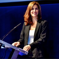
Raquel Mateos
Head of Communication, Press and Marketing at Unió de Federacions Esportives de Catalunya
“I have worked with Ferran in the redefinition of the image and the opening of a television program on competitions of the federated sport. I can highlight from him that he has good proposals, works within timings, offers a professional and flexible execution to changes, and very demanding on the result.”